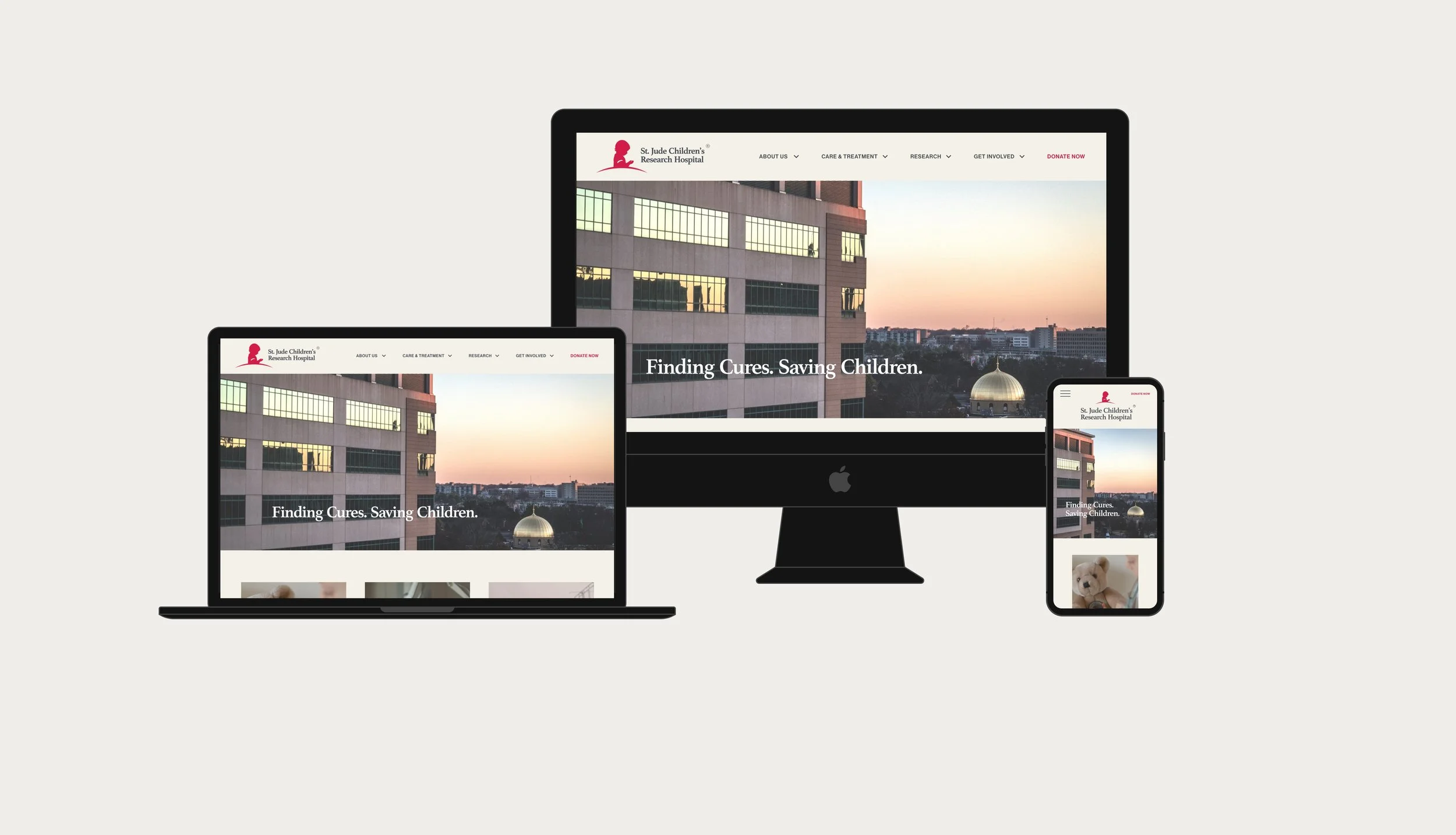
case study —
ST. JUDE REDESIGN
(A)
The Problem
It is very difficult to navigate the extensive information available on the website. At the time of this project, the donation flow was unresponsive, creating a very clumsy mobile-based donation flow.
(B)
The Solution
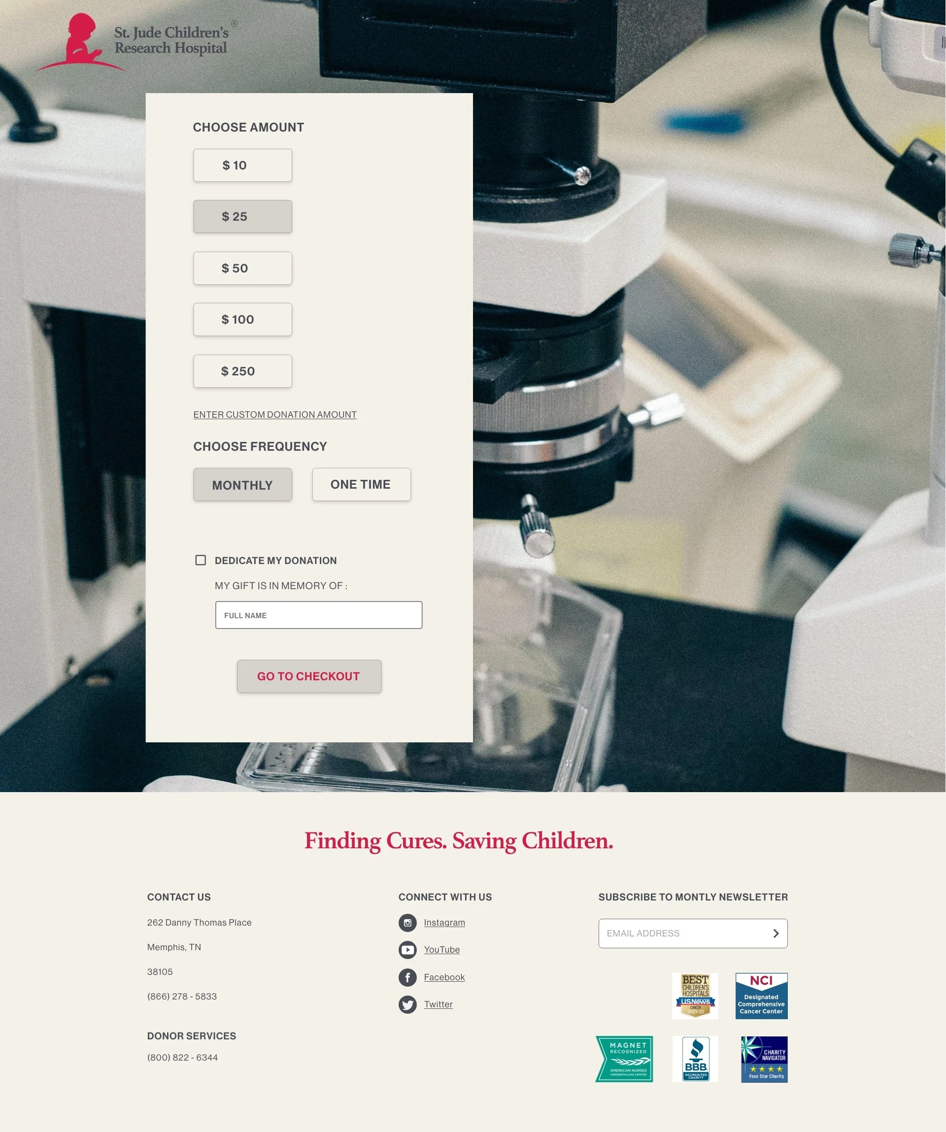
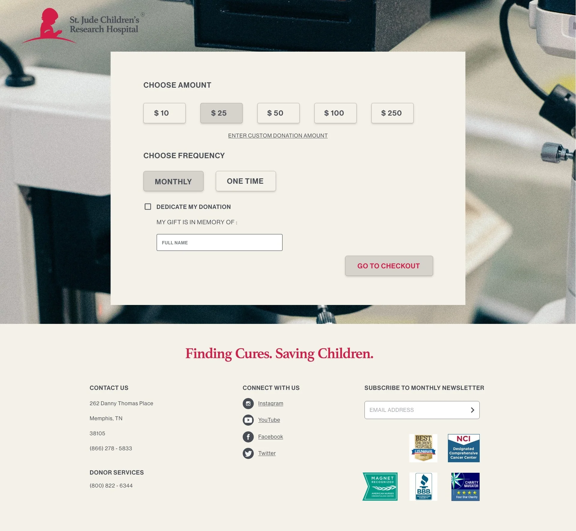
Design a hierarchical responsive website and mobile product with graceful degradation for their donation flow so users can clearly navigate through the task.
(C)
My Role
UX designer and researcher. Conducted interviews, drew wireframes, prototyped, hosted usability studies, accounted for accessibility, and iterated on all designs with graceful degradation.
STEP 1 : UNDERSTANDING THE USER
EMPATHIZE + DEFINE
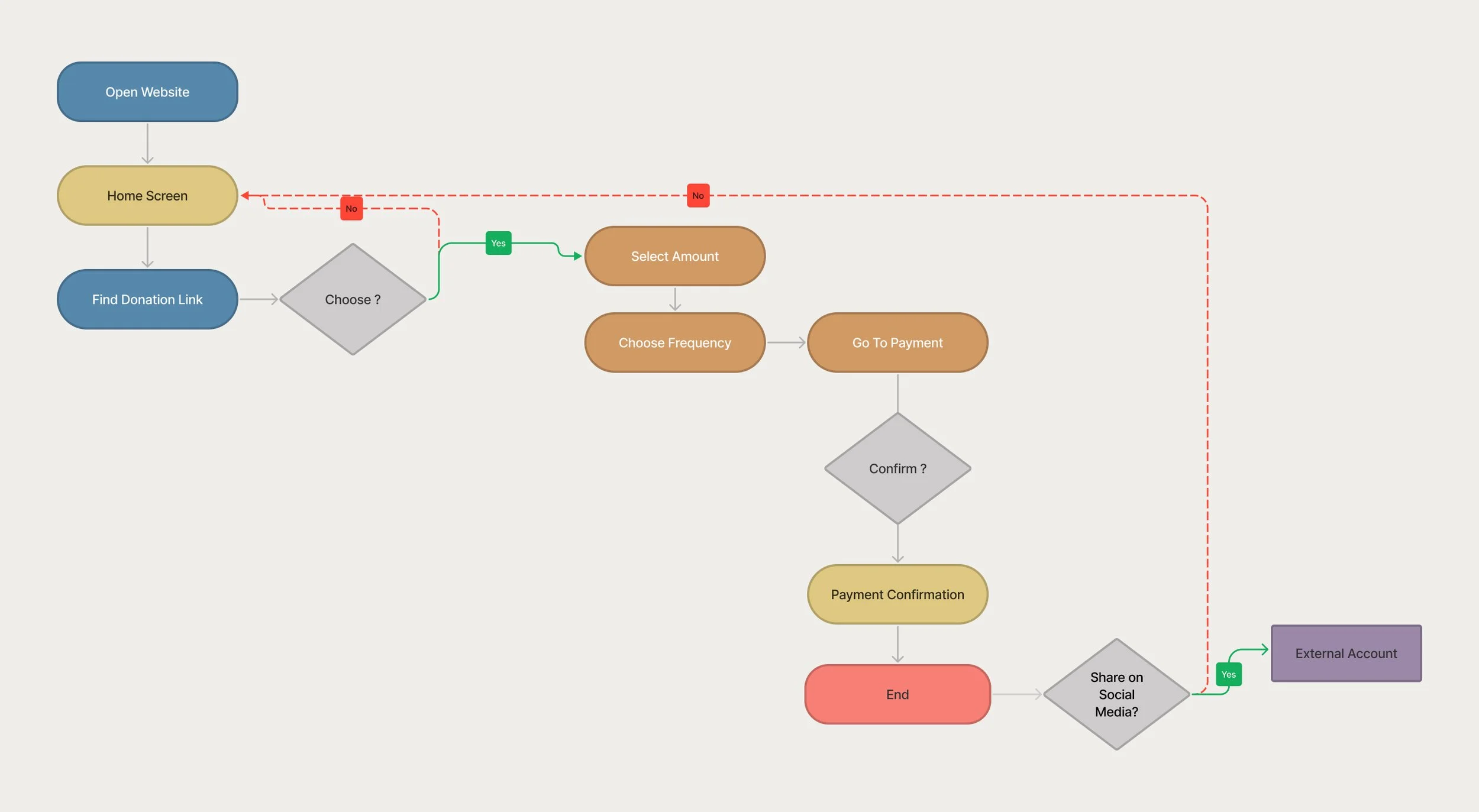
I conducted interviews with usability studies on the original website to best understand the target user and their immediate needs. I discovered many users are easily discouraged when they participate from their phones and attempt to navigate the current website. Many users would not revisit the website because they couldn’t find essential information again due to the matrix organization. Donating often happens in a heightened emotional state, and what should be an enjoyable experience was challenging for them. This critical feedback helped me define how to best move into ideating and design.
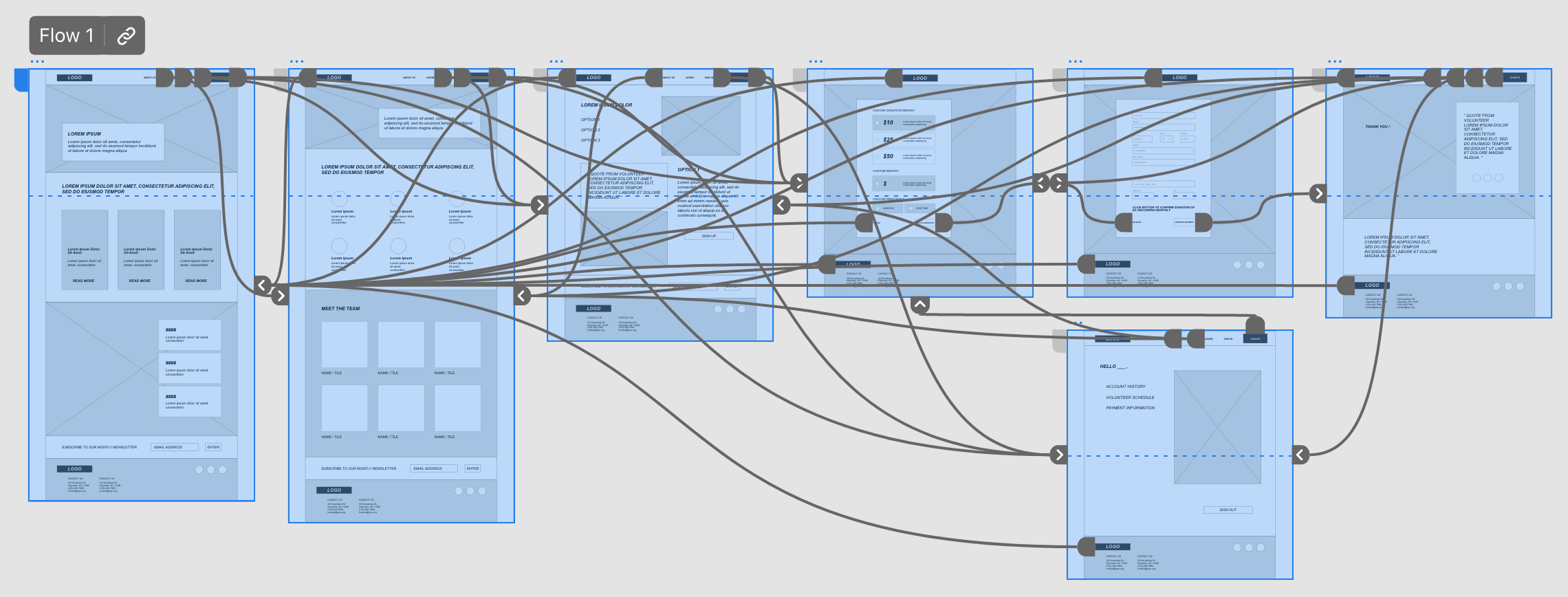
User Flow
STEP 2 : DESIGN
IDEATE + PROTOTYPE + TEST
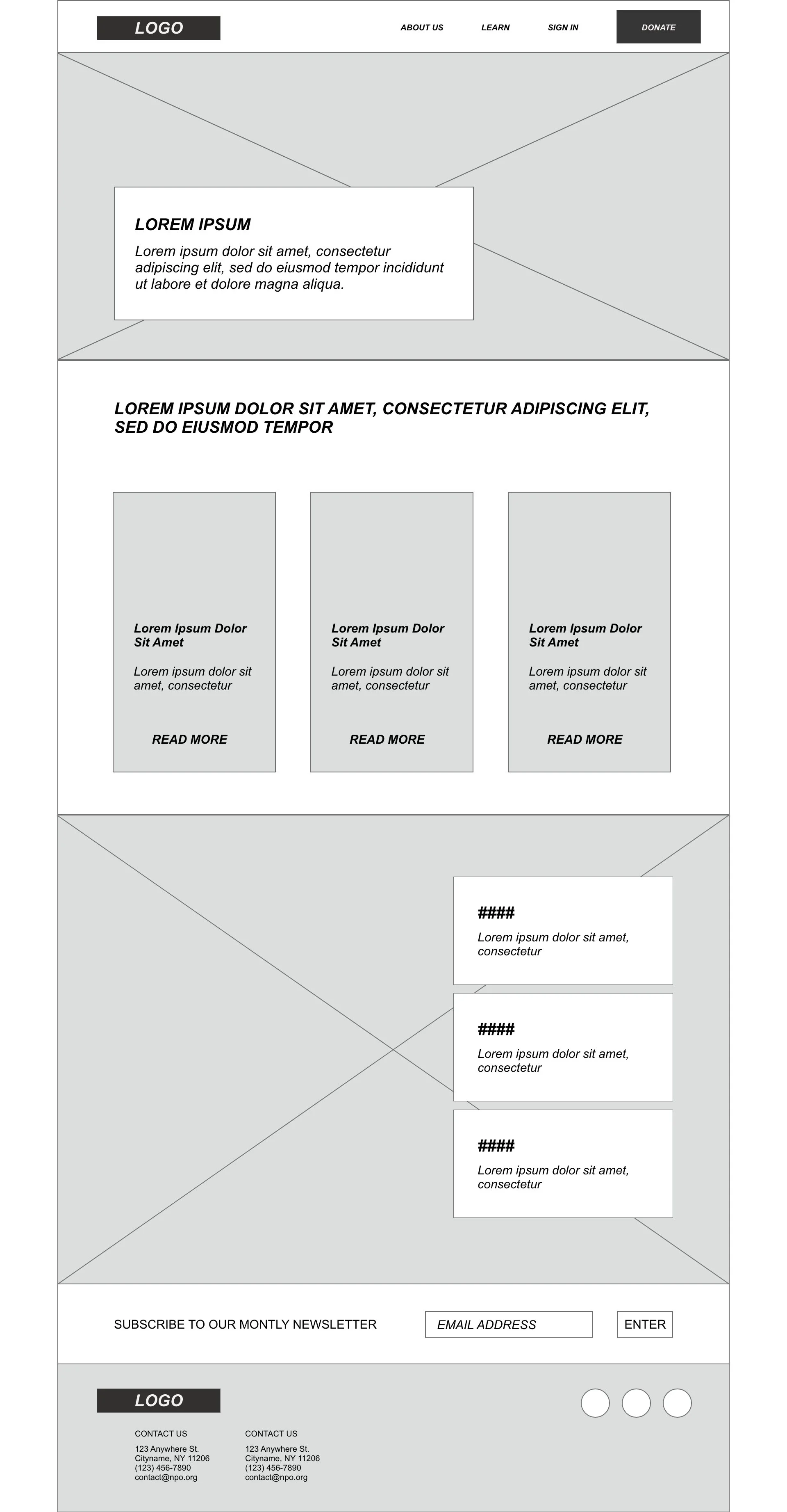
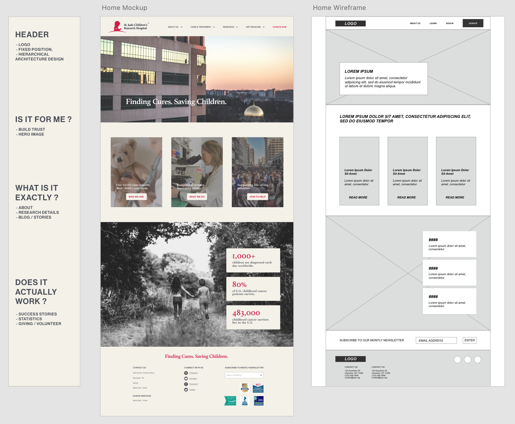
I sketched out several iterations of paper wireframes keeping the user's pain points about navigation, browsing, and donation flow top of mind. Because St. Jude’s donors access the site on a variety of different devices, I created designs for additional screen sizes to make sure the site would be fully responsive.
I transferred my best ideas to digital wireframes so I could efficiently iterate on design feedback. I tested my wireframes with a focus group, and they all mentioned there was too much information presented, so the edited wireframes below are my second iteration.
As always, these user-informed wireframes are the fuel to begin my prototypes and mockups!
Desktop
Tablet
Mobile
MOCKUPS
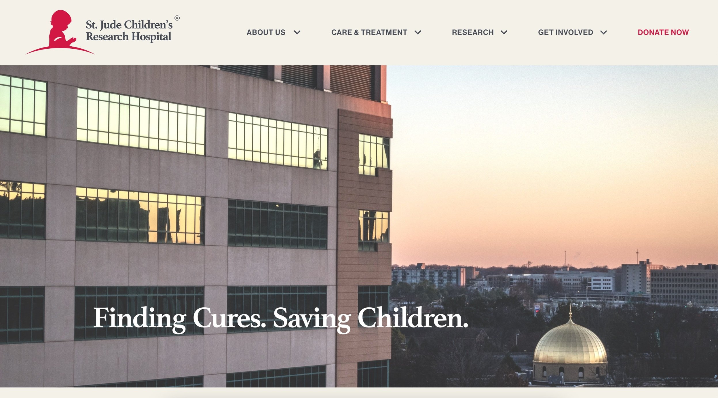
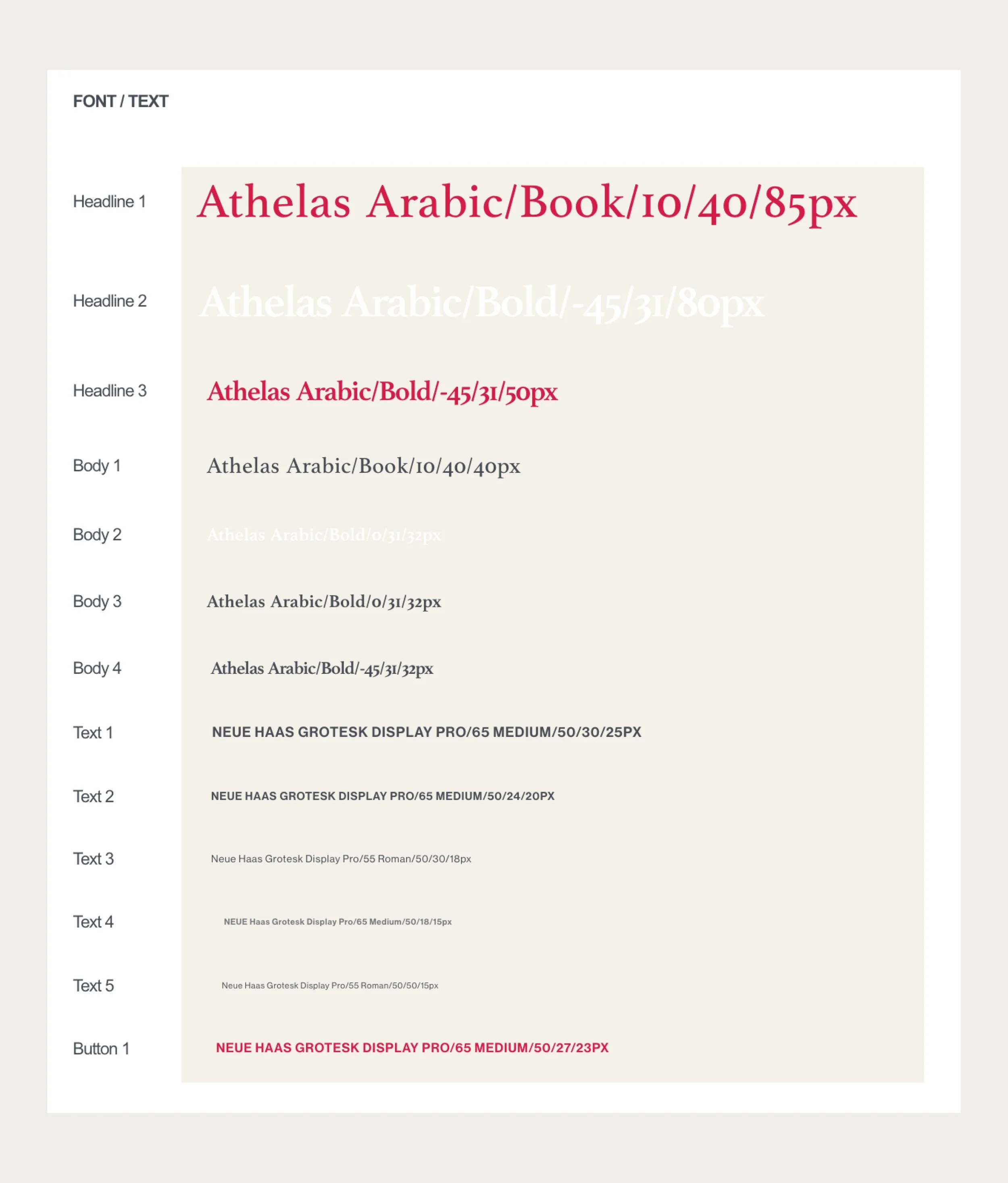
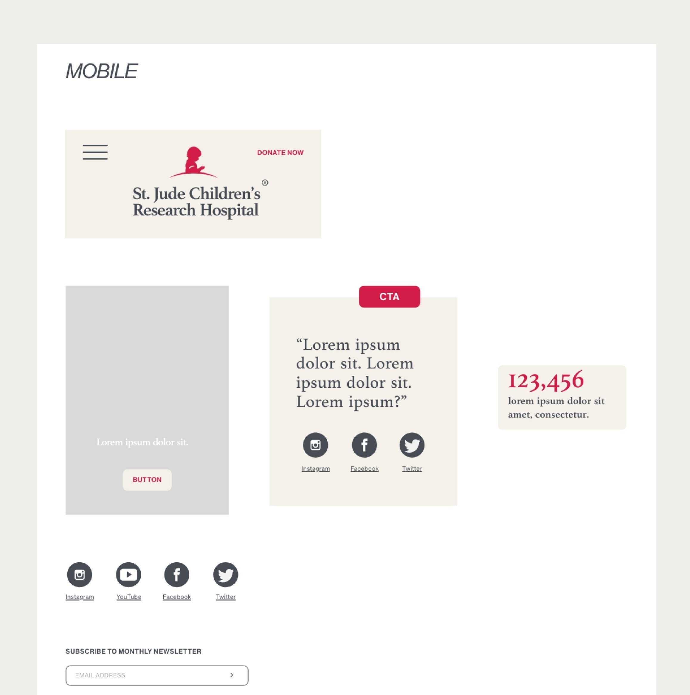
I love this phase of my design process. Using empathetic awareness I created an aesthetic mockup to complement the feedback and research received in my user testings and initial research. The design met user needs for a positive, calm, and trusting emotional experience as they completed the donation task.
Existing
Proposed
V.1 Donation Design
V.2 Donation Design
GOING FORWARD
WHAT I LEARNED :
This graceful degradation design was my first project in Adobe Xd. I loved applying my process to this elegant design system. It was challenging to stay in my donation flow task and not get distracted by how poorly the entire website was organized. I found myself wanting to solve more problems besides the donation flow. I have so much to learn regarding added accessibility to my projects, I wanted to have more research participants with disabilities, for more valuable insights, and at the time of user testing, it was not an option.
ACCESSIBILITY ANALYSIS :
With everything I create, from tech to fashion to interior design, equity-focused, inclusive design is a posture and responsibility I take very seriously. As I continue to design, the accessibility elements of the design process continue to inspire and motivate me. There is so much I don’t know and I’m constantly iterating and experimenting on designs to learn.
NEXT STEPS :
Redesigning the entire website to be a digestible hierarchical structure would be step two! The matrix organization is overwhelming and I think it would add to the brand’s credibility if its platform was updated with clear organization and user-centric aesthetic design.
Thank you for going on my design journey!
All processes are documented here.
